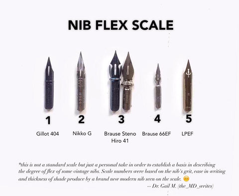
This flex scale is based on personal point of view of Dr. Gail Madalag to come up with a useful guide and reference. Brand new nibs were used to test the flexibility. Flex scale (FS) ranges from 1 (least flexible) to 5 (most flexible). Modern nibs as point of reference:1 - Gillot 4042 - Nikko G, Tachikawa G3 - Hunt 56, Hiro 414 - Brause 66E5 - Leonard Principal, Hunt 101 HOW TO PREP NEW NIBS:New nibs are coated with a special coating or shellac to protect it from rusting during transit. That special coat or shellac prevents the ink from fully adhering to the surface of the nib. There are several ways of removing it to fully prepare your...
I've been meaning to make a short clip on how to make the most of the loose guidelines (1 with slant, 1 without a slant) that's included in a CalligraPad or Padlet by @calligrapads and generally all the guidelines that you have and some of the important tips I got from @drjmvitolo @masterpenman and IAMPETH archives.. Happy to have finally made one. It's gonna be a long post but I'm hoping that it will help.. They are called "guidelines" for very obvious reasons: they are meant to 'guide' you and help you when you practice especially when you want to get serious with pointed pen and delve deeper into the classics.. Lines are very essential for developing consistency and...
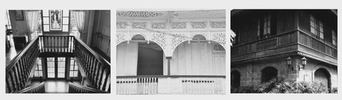
Inspired by the rich traditional balusters of Filipino ancestral homes – from the seating and aparadors (clothing cabinets) to ventanillas that allow air to flow in and out of the homes Filipinos grew up in, to decorative details in staircases. Balustre pays tribute to the craftsmanship of skilled karpenteros (carpenters) in hand-carving the fine details of the balusters. All the pens turned in this series have the same signature Balustre detail. Top: Dyosa Ink Well L to R: Dyosa (oblique), Dyosa (straight), Rizal (oblique), Rizal (straight), Bolo (light), Bolo (dark), Señorita, Diwata (oblique), Diwata (straight) You will love the modifications we did on the flange for my Series 2. Thicker metal, brass buff finish, deeper attachment and pinned for...
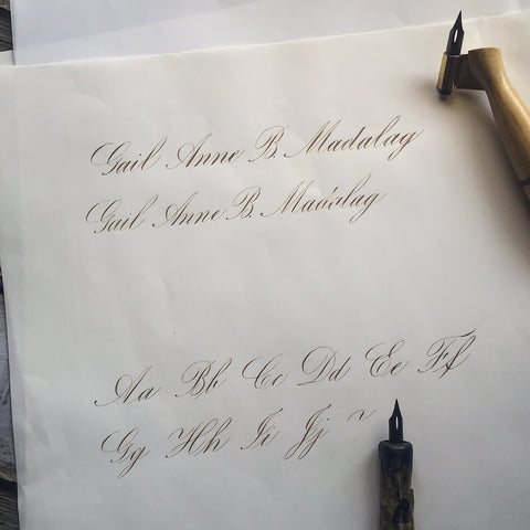
Which pen wrote which? Can you tell the difference? Can you guess which pen I used in writing specimen 1 and 2? What's really the difference in using oblique pen and straight in Copperplate script? Can we use straight pen in writing slanted script like Copperplate and Spencerian? You may have observed that the shades in 1 is thicker than 2 making the entire length of the name longer as well.. But apart from that and looking from afar, not much difference, right? Zooming in a bit.. We can now observe that the shades in 1is more defined than in 2 and you can now see the "ragged" edges on the right side of the shade better. Why so? It...
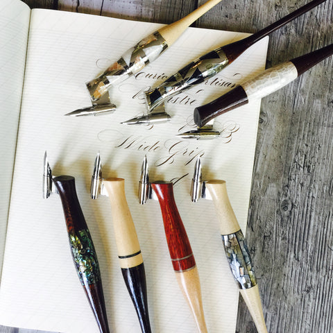
Like a calligrapher's preference to a certain style of pointed pen calligraphy, so does the preference to pen grip. Hence, I'm releasing this limited edition widen pen grip version of Series 1 due to numerous requests. Still with the same beautiful shell inlay and excellent craftsmanship of our local artisans, this version offers comfort to those who are used to thicker pen neck grip are with its 11mm (3.5/8") measurement.